
In this case
Visual identity
Design concept
Branding
Tagline
The design concept Built by Cells leads the way for the tech company Flex Applications.
Challenge
Flex Applications is a Swedish tech company that “helps employers and employees work smoothly and intelligently with everything related to HR, workforce management, and payroll.” After 30 years in the industry, the company needed to revisit its brand and visual identity to better reflect Flex Applications as an innovative tech company.
Solution
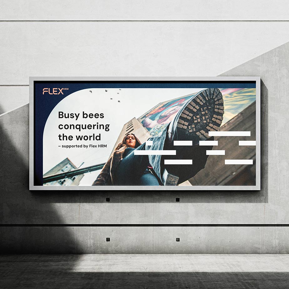
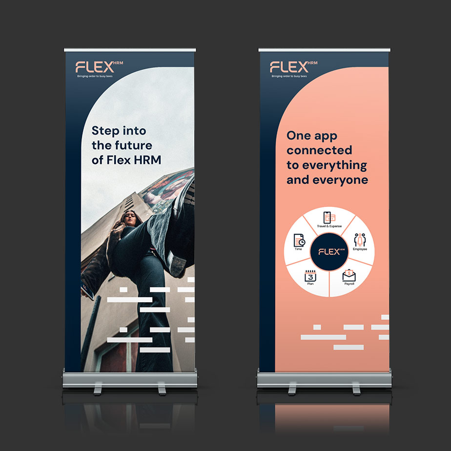
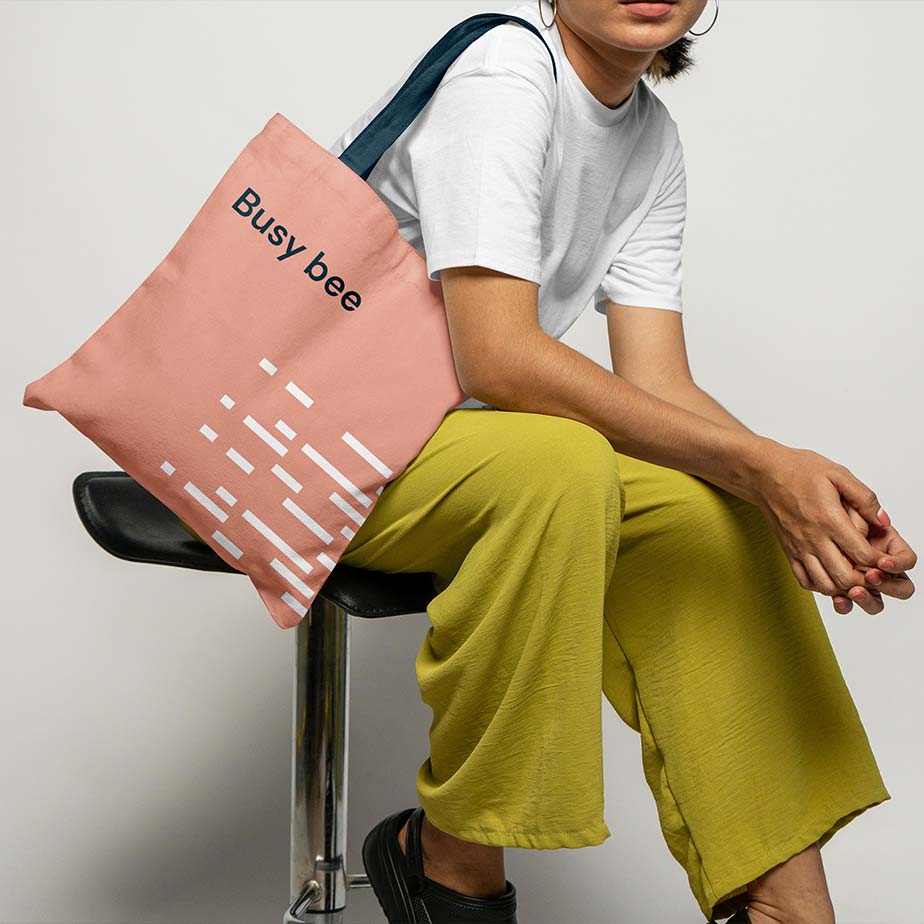
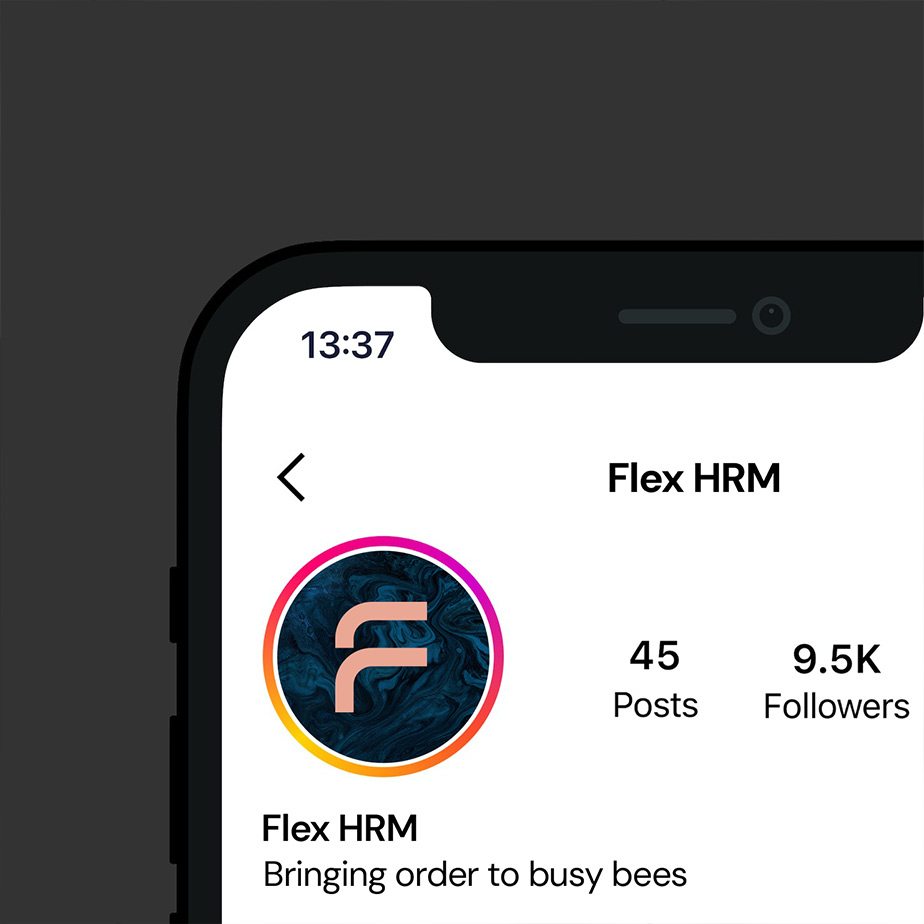
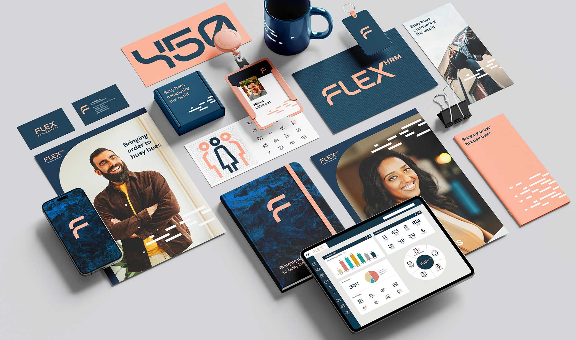
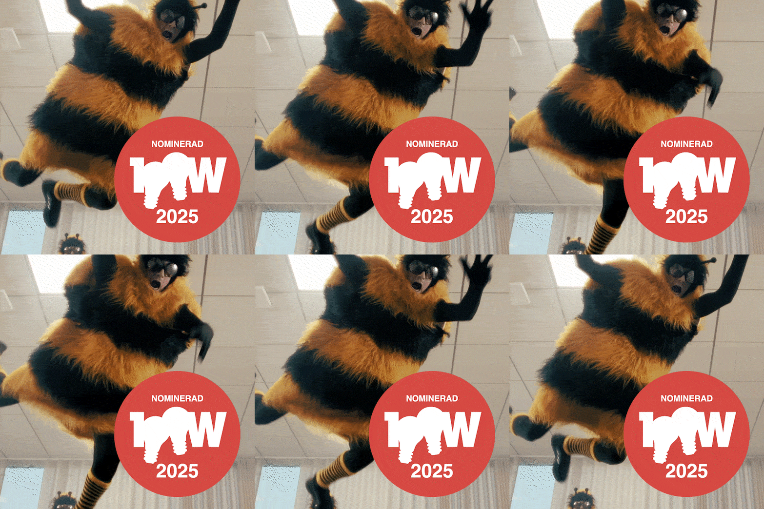
The design is rooted in the new concept Built by Cells, inspired by the Flex user interface. A generic and dated visual language was replaced with an energetic, contemporary expression that felt premium and challenged category conventions. We also introduced a new tagline — “Bringing order to busy bees.” The aim was twofold: to highlight the users of the HRM system and celebrate the hardworking busy bees around the world who help build strong companies. It also communicates that Flex is on the users’ side — that it understands the challenges of their everyday work and strives to ease that burden through a system defined by clear structure and a user-friendly interface. In short: structure, clarity, and payday on Friday.
Result
Lotta Erdtman, CMO at Flex Applications:
“After a long and demanding process, we have arrived at an end result that we are incredibly happy with and proud of. Flex Applications is a forward-looking company with a clear ambition to think in new and bold ways when it comes to our product portfolio. Now we have made sure that this is also reflected in our visual identity.”
In 2024, Flex was nominated for the prestigious Swedish Design Award in the category "Graphic Identity – Redesign".
Agency: Project created by Think Happy Thoughts
Built by cells
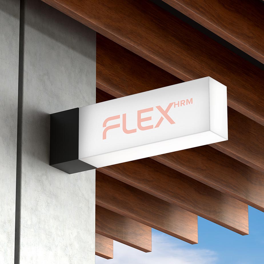
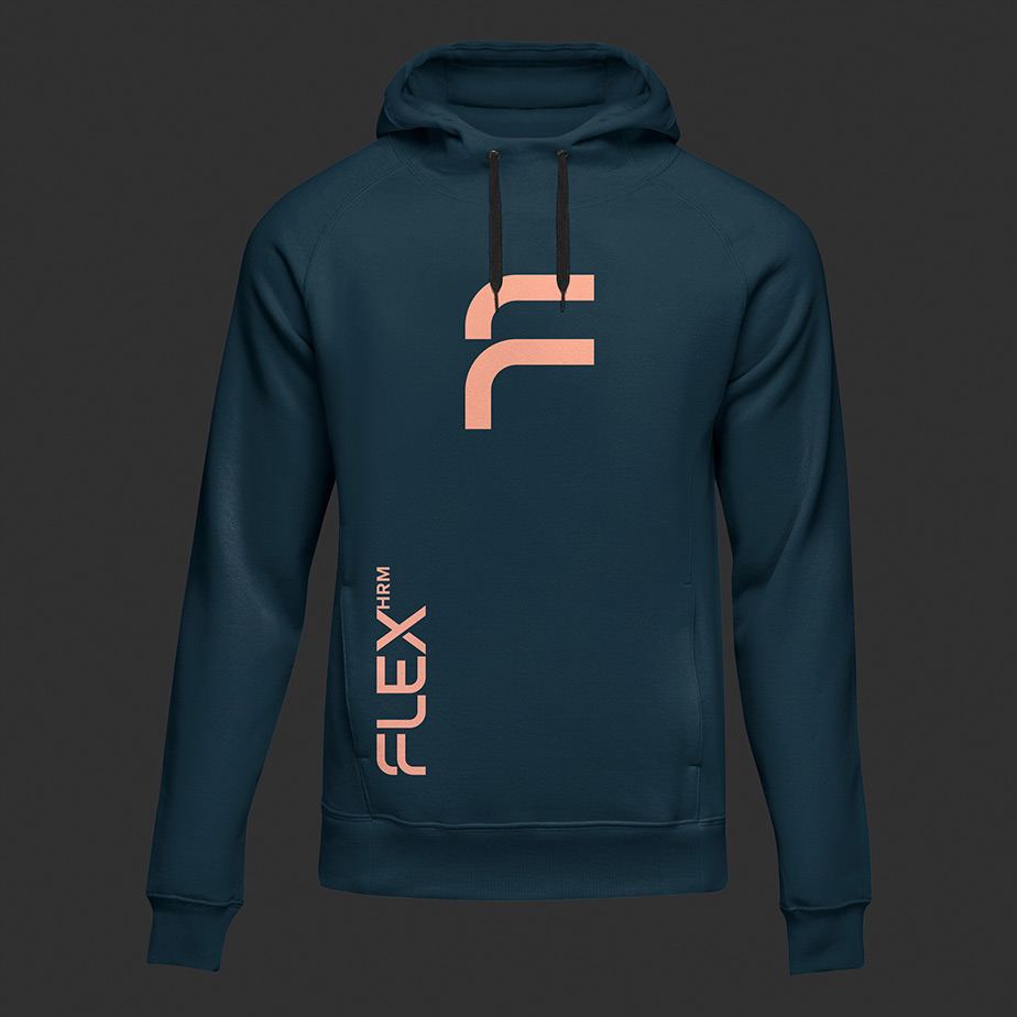
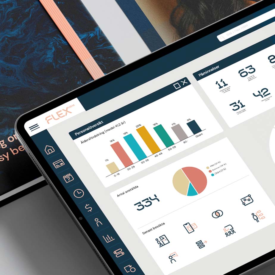
Our design concept becomes a symbol of structure and order, inspired by our Flex HRM tool — an everyday reality made up of rows, columns, and data input. This informs our design approach and is reflected, among other things, in our use of grid systems, the appearance of our logo, and our pattern.

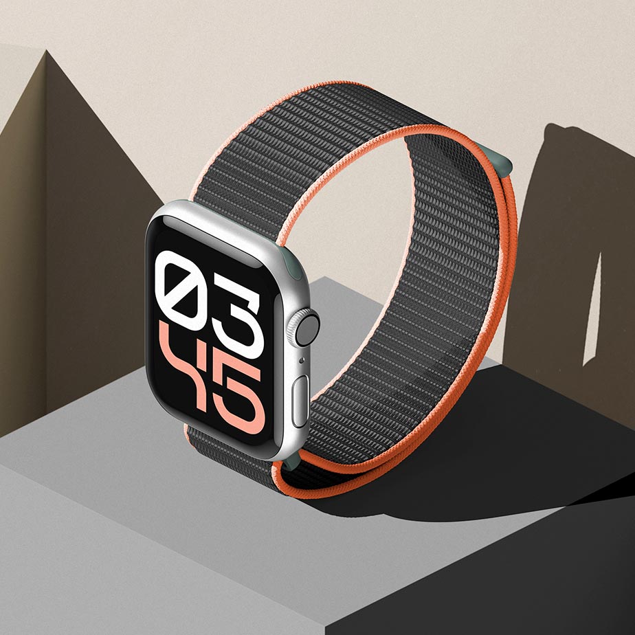
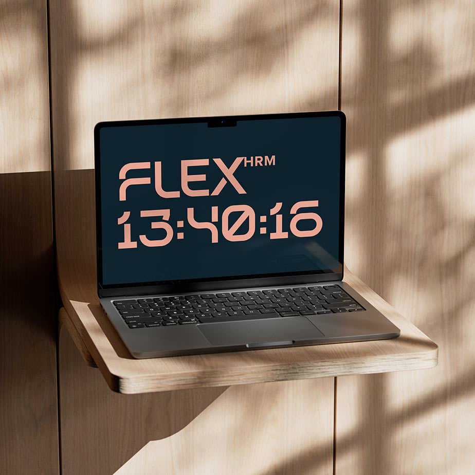
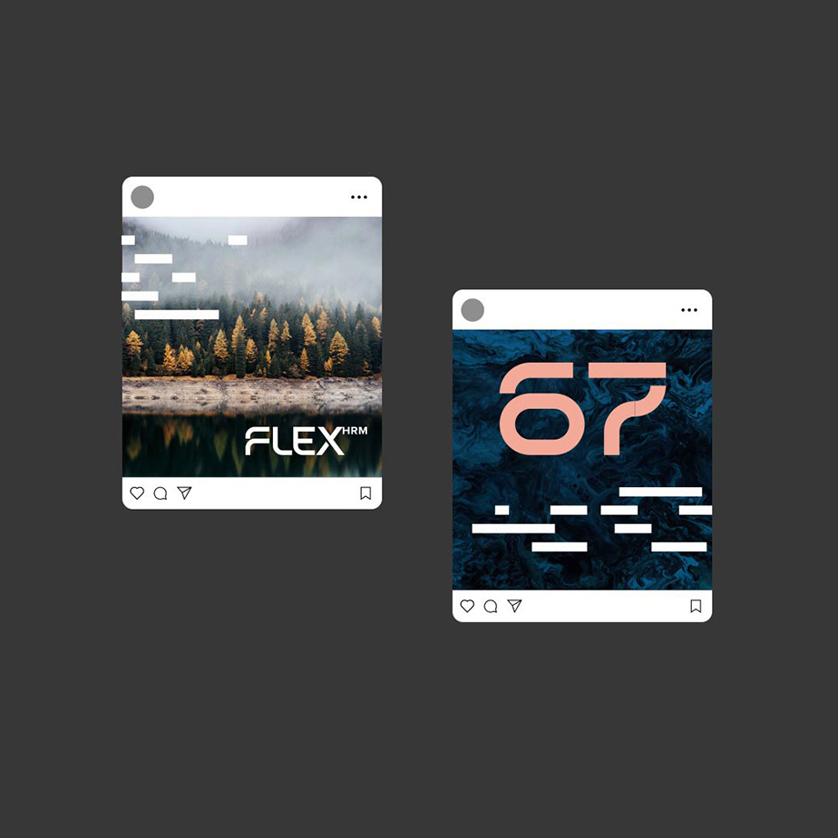
Custom-drawn numeral typeface
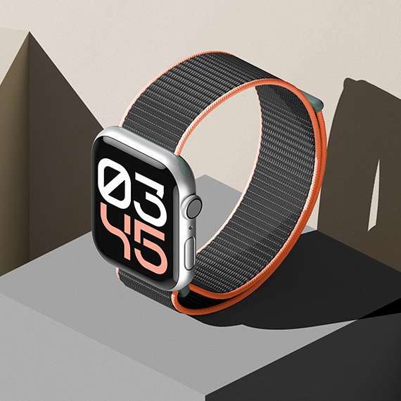
The numerals in the Flex Numbers typeface share a clear visual relationship with the logo. Both are rooted in the "Built by Cells" design concept.
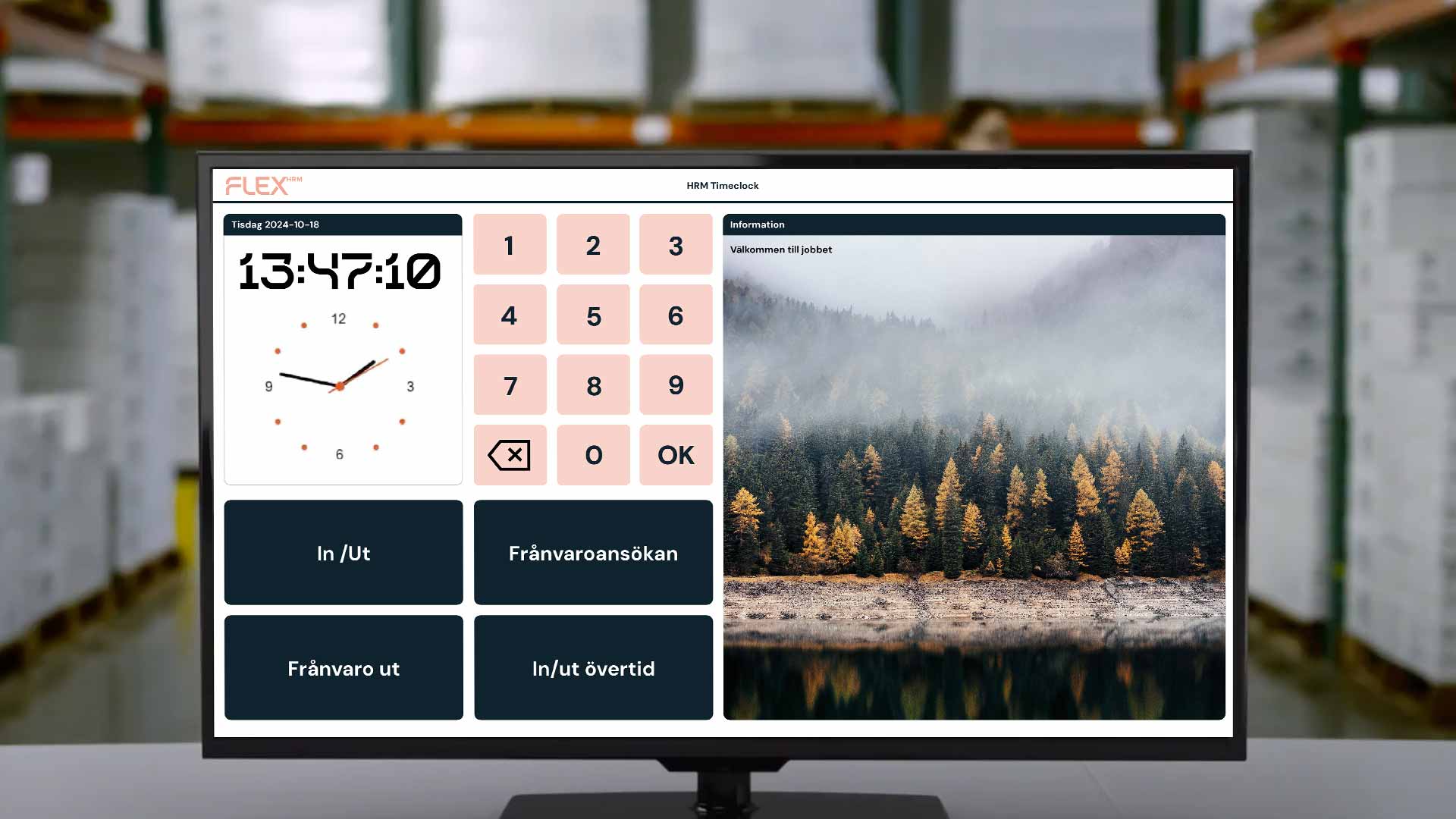


Digital brand book
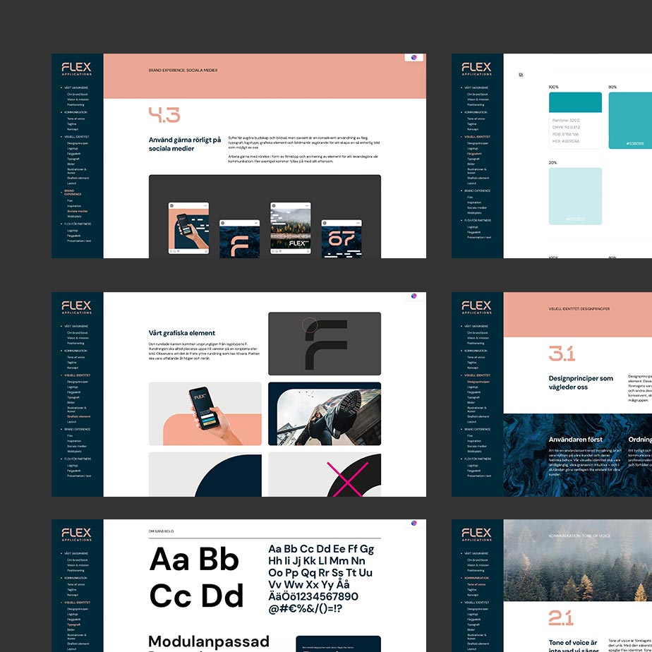
To strengthen brand consistency and simplify day-to-day brand management, we developed a digital brand book. The platform gives the client greater control over how the brand is accessed and used, with login-based permissions, downloadable assets, and the ability to present motion content such as animation and film. Most importantly, it creates a single source of truth — a central, easy-to-update resource that ensures the latest version of the brand reaches all audiences at the same time.
Selected Works
Flex branding & interfaceUX, branding

Marketing minds branding and conceptBranding, Concept


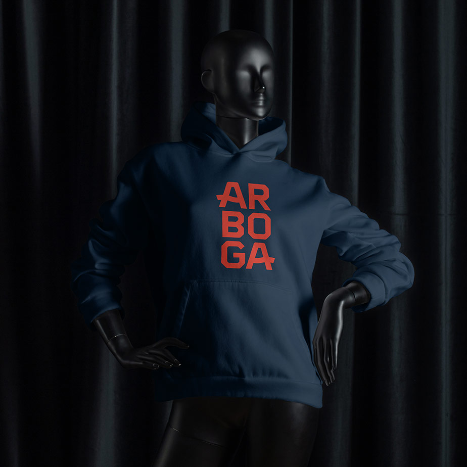
Arboga place brandingBranding, strategy
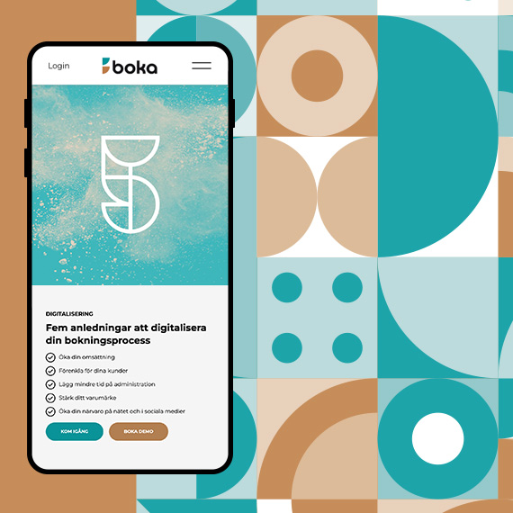
Boka branding & webUX, branding
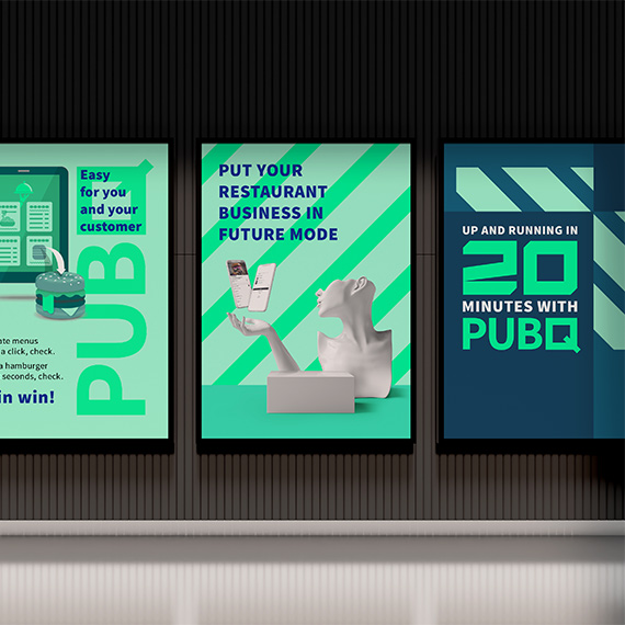
PubQ branding & webUX, branding
Canvac packagingPackaging, branding
Moz conceptConcept