
In this case
Visual identity
Place branding
Positioning
Arboga – building the future’s history
Challenge
Arboga is a place with deep historical roots. Dating back to the late 13th century, it played an important role in Sweden’s iron industry and is also known for local products such as beer, pâté, and margarine. But while Arboga’s heritage is rich, the municipality felt that the story of the town had become too closely tied to its past.
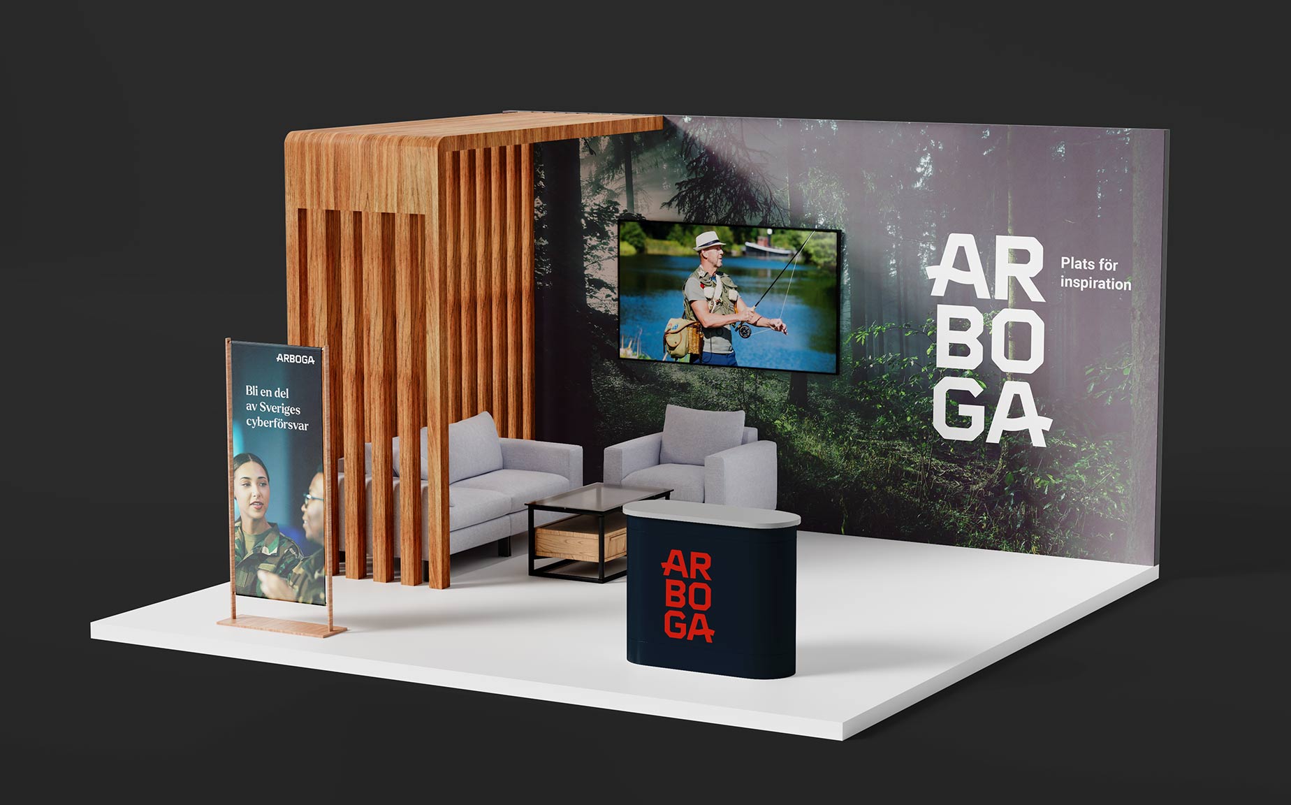
At the same time, Arboga has far more to offer than its historical legacy alone. Today, the municipality is also associated with forward-looking industries such as SaaS, IT, security, and parts of Sweden’s cyber defence sector. Both the municipality and the local business community wanted to communicate a more modern, relevant, and future-facing image of Arboga. The challenge was therefore to reposition the place brand and move away from a visual identity that mainly evoked the town’s medieval history – without losing the sense of authenticity and continuity that makes Arboga unique.
Solution
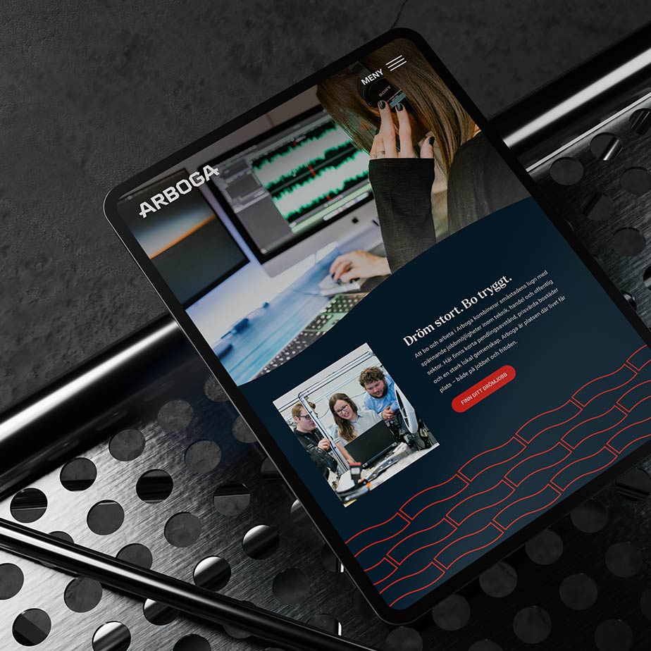
In 2023, Arboga municipality began developing a new place brand to replace the previous platform from 2007. Our task was to create a visual identity and brand platform that could tell the full story of Arboga: a place shaped by history, but equally defined by progress, confidence, and future potential.
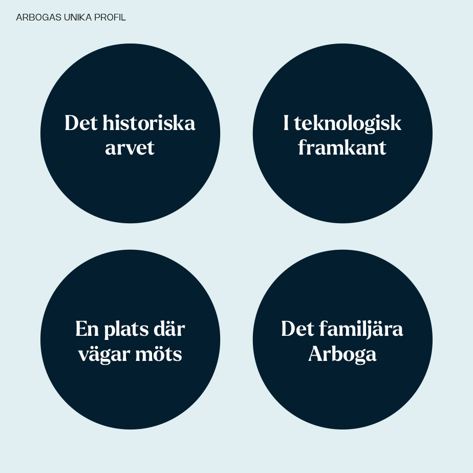
The work was grounded in our place-branding process, including analysis of the surrounding landscape, positioning, a brand promise, and message hierarchy. We also built on research conducted with residents, which highlighted the place’s most valued qualities and helped define a direction rooted in both local pride and future ambition.
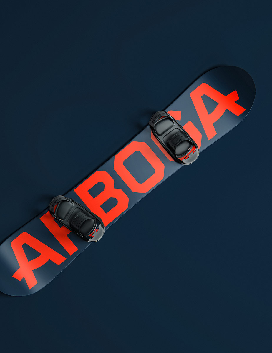
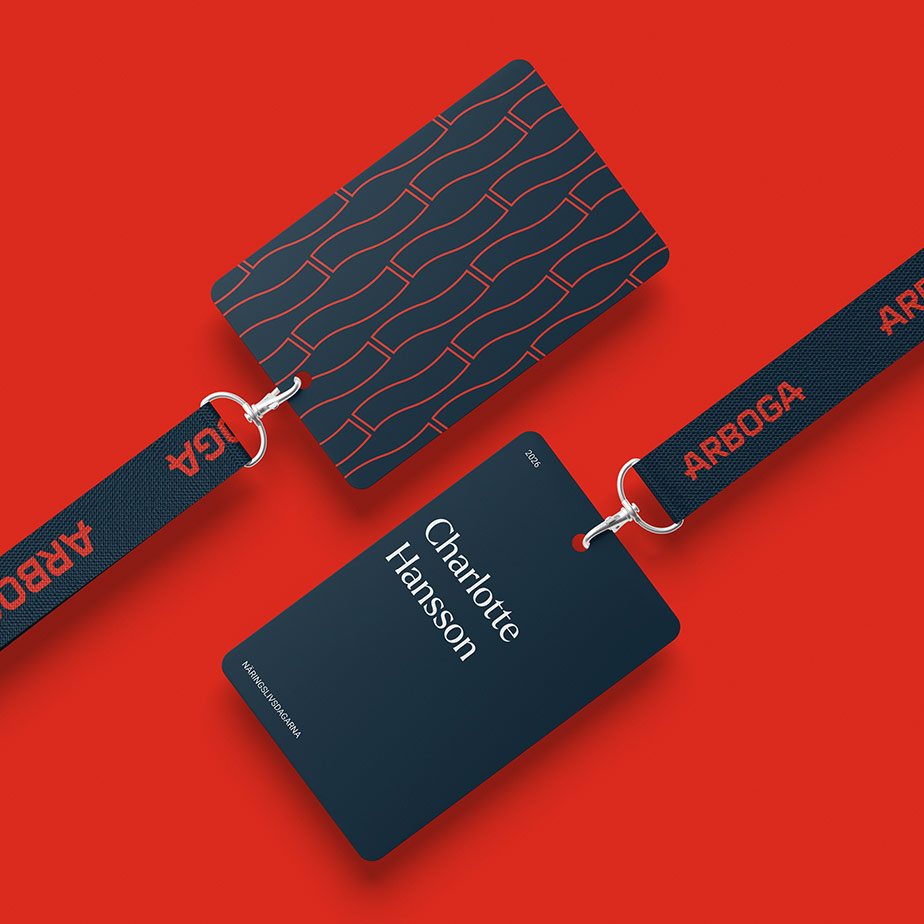
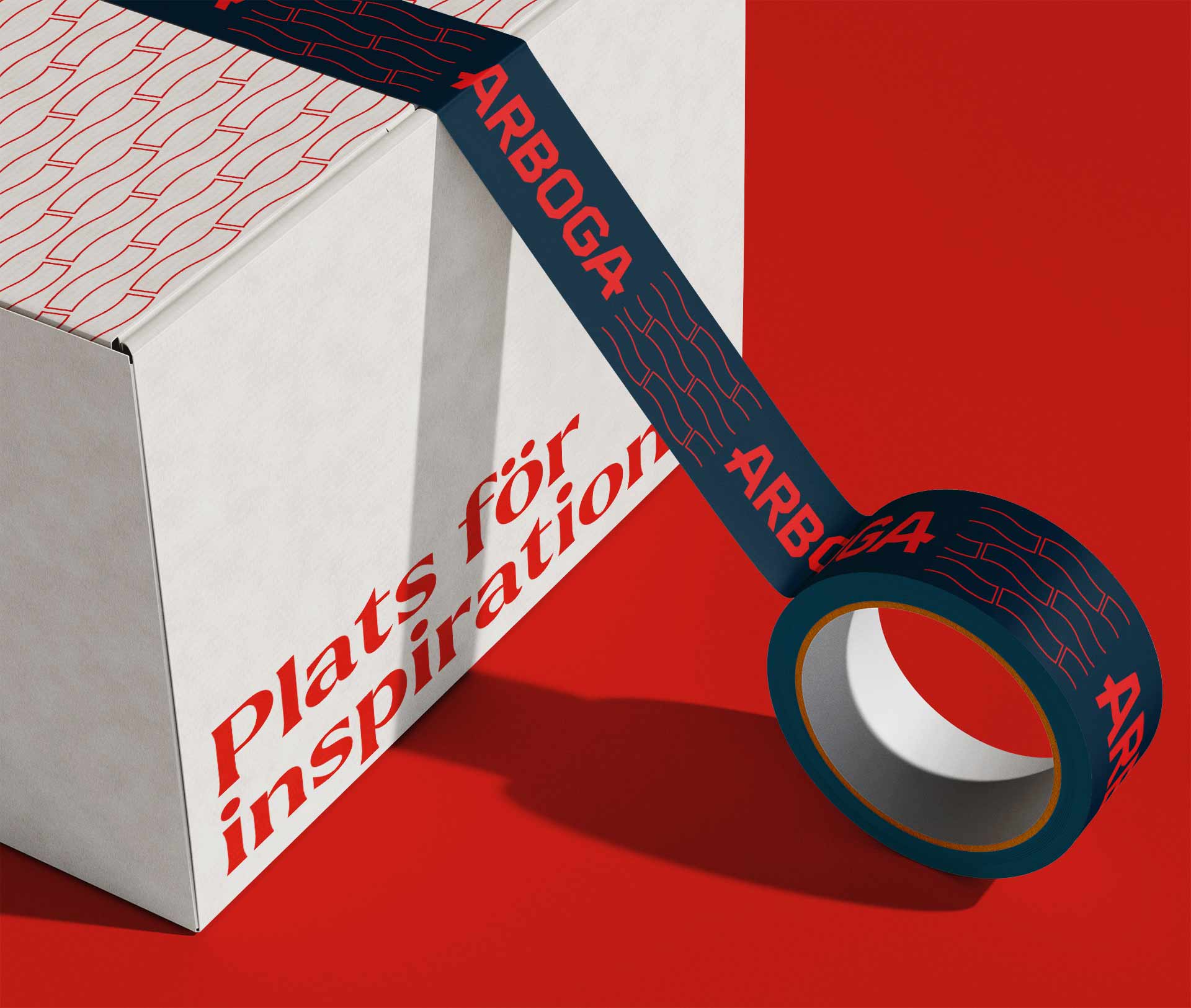
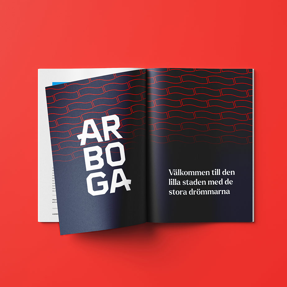
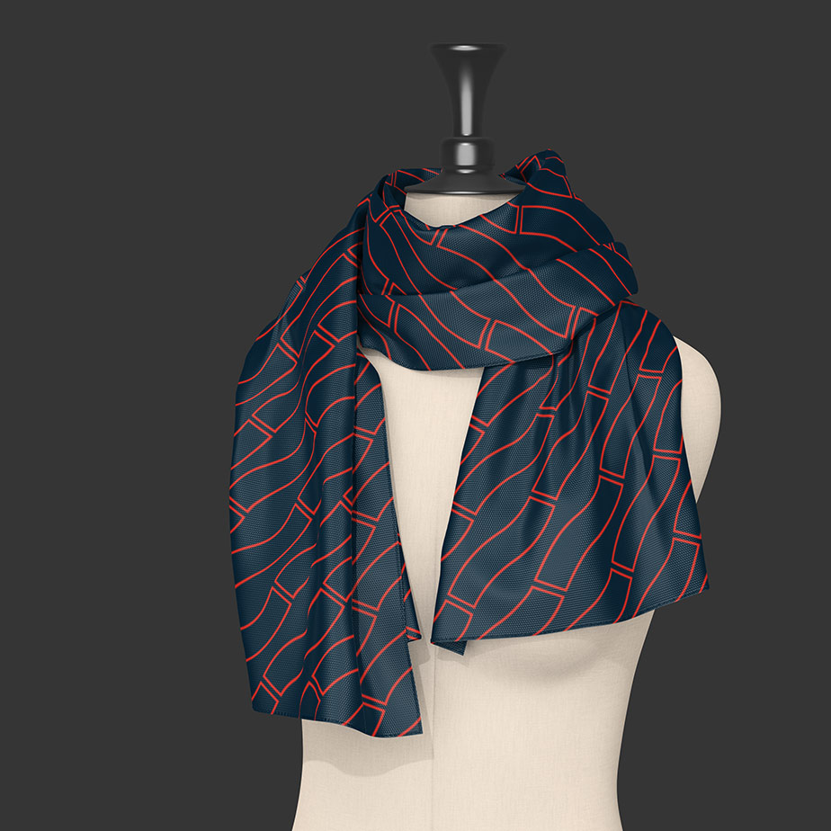
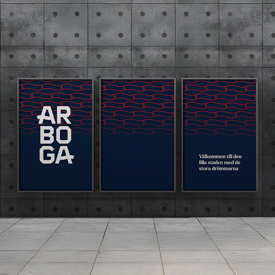
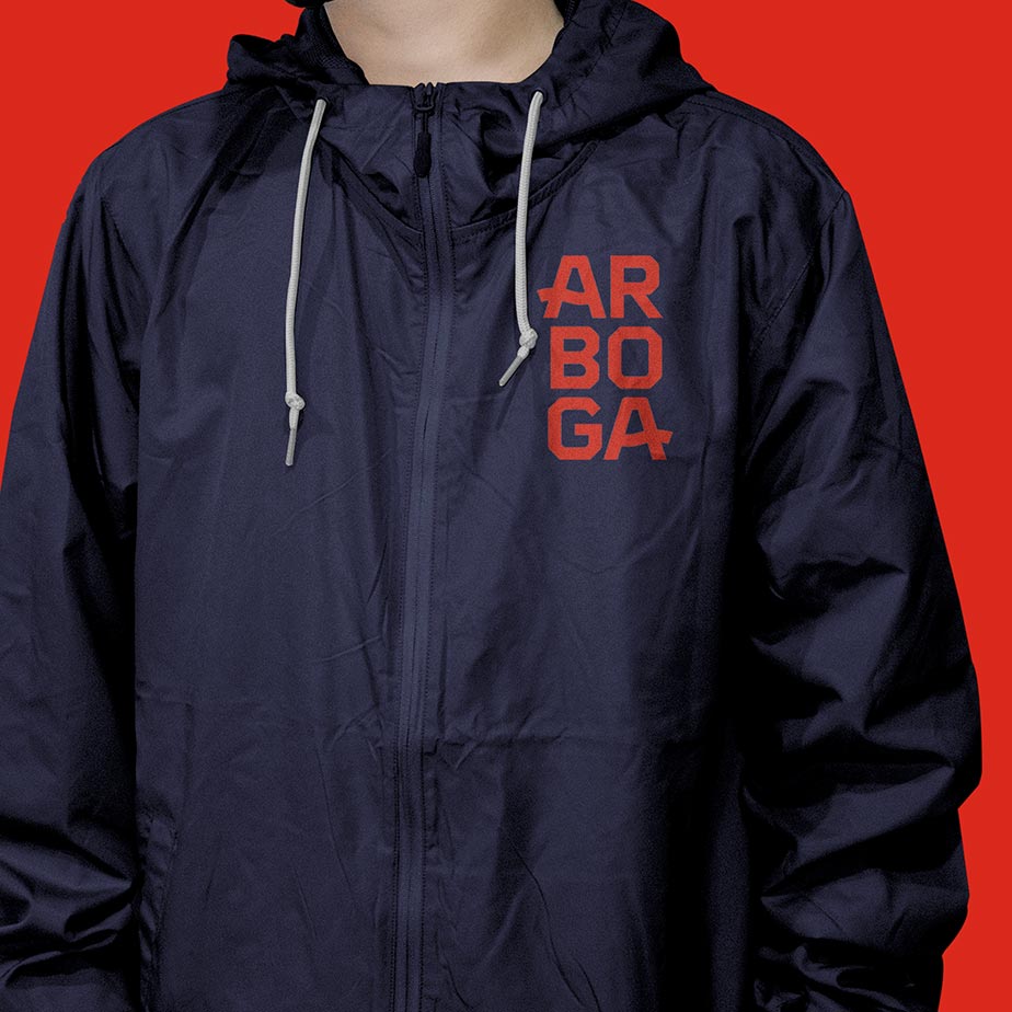
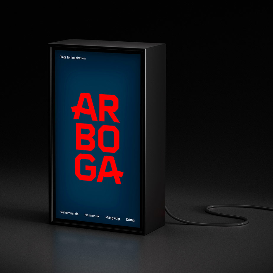
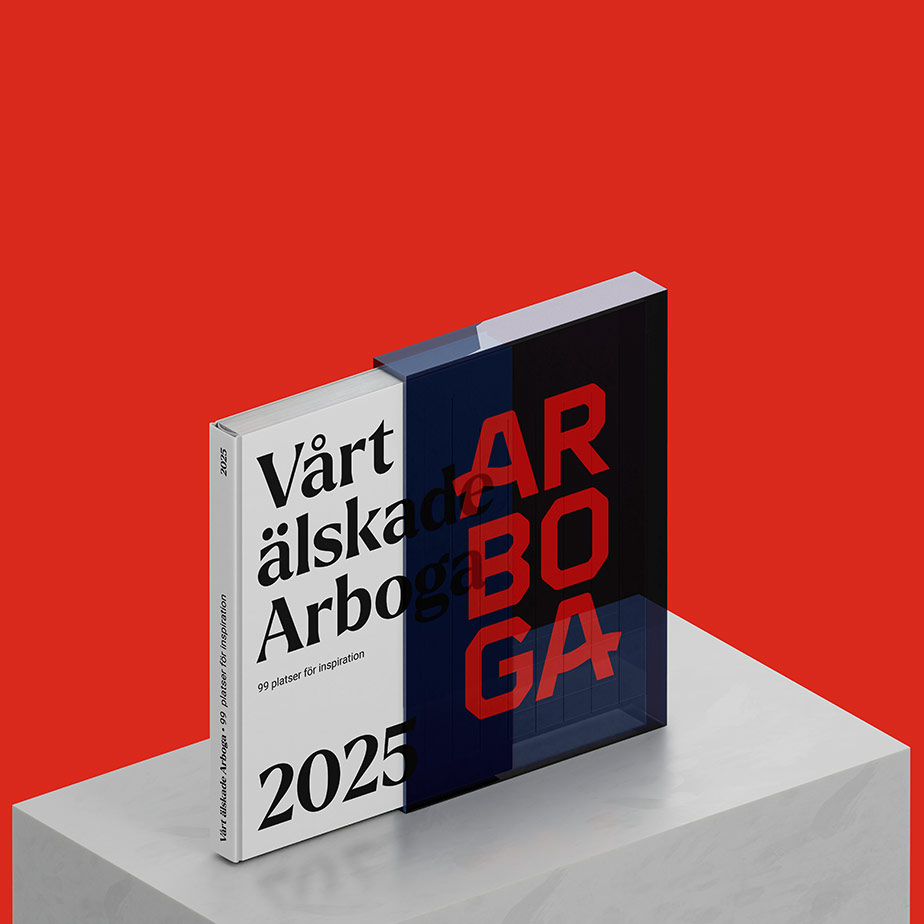
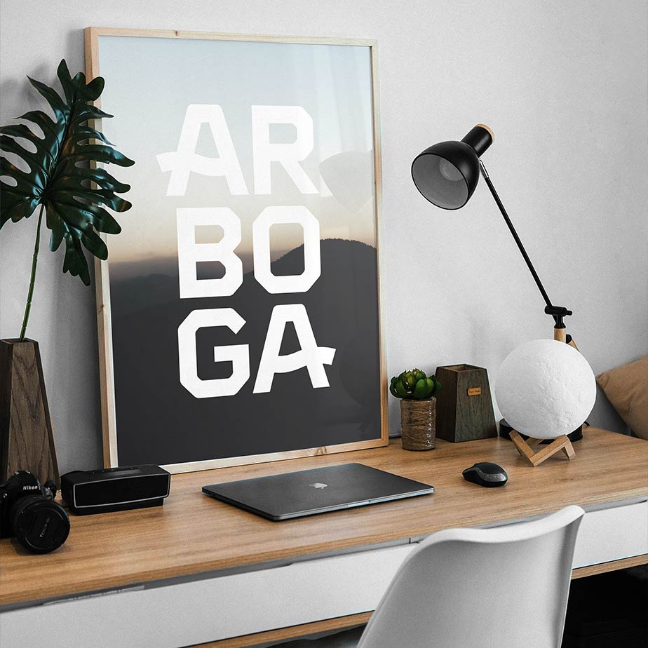
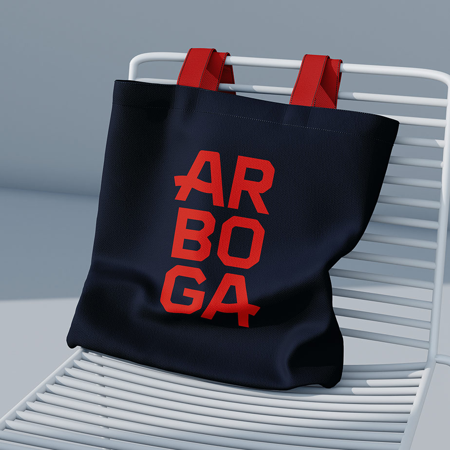
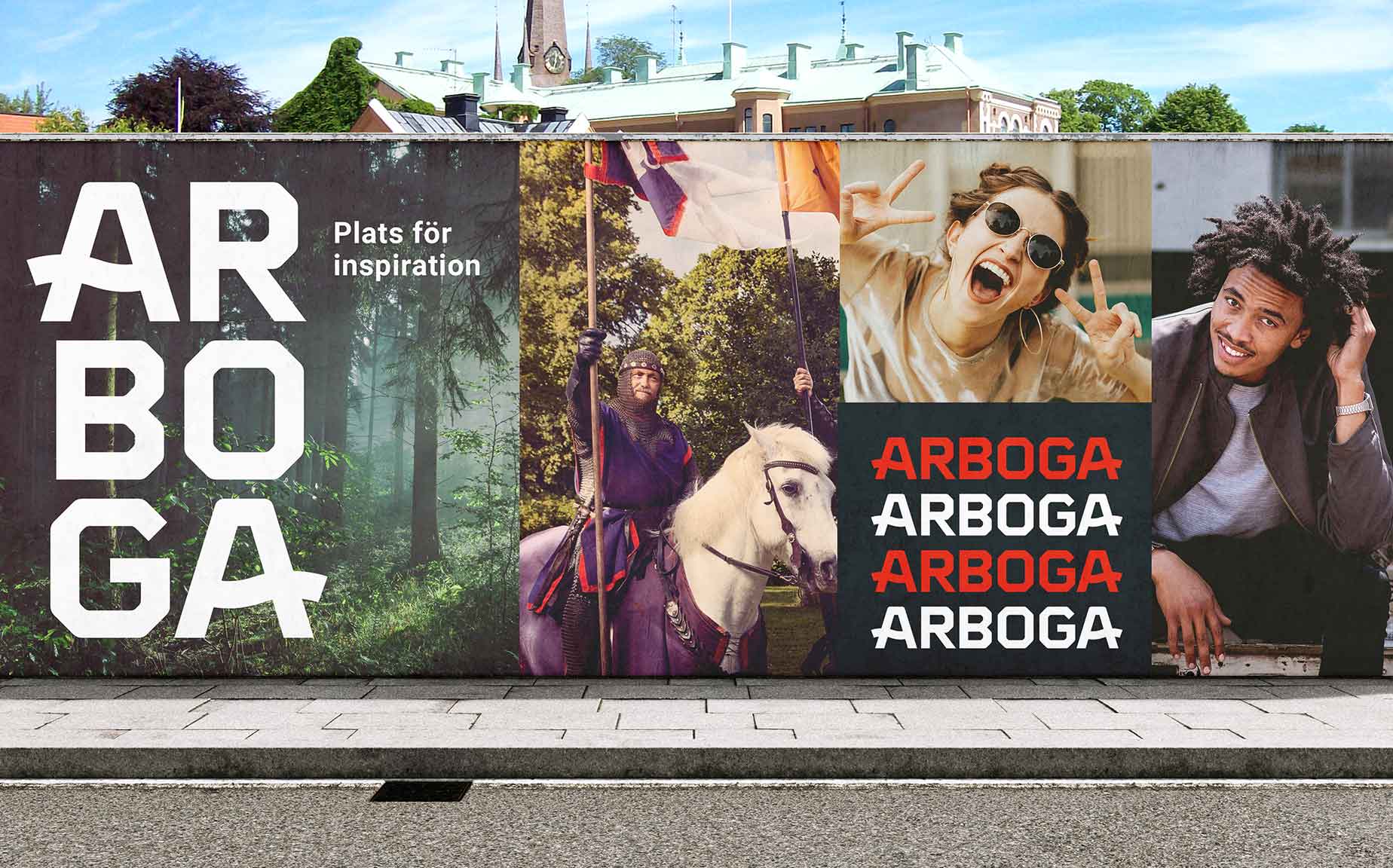
The new identity takes inspiration from Arboga’s name and geography. The name is derived from an old form, “Arbughi,” meaning “river bend,” referring to the curve of the river that runs through the town. The logo draws on this heritage through a subtle wave-like movement – or bend in the stream – embedded in the first and last letters of the wordmark. Just as the river enters the town from one side, moves quietly through it, and continues out the other, the logo carries a sense of flow, direction, and continuity.
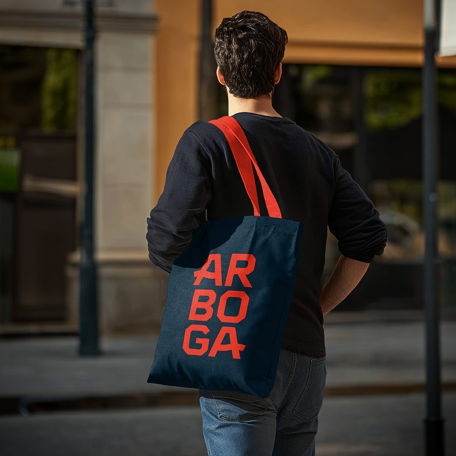
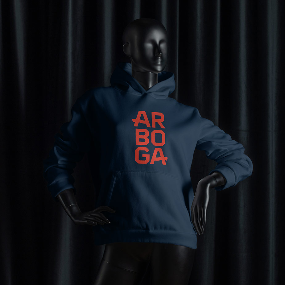
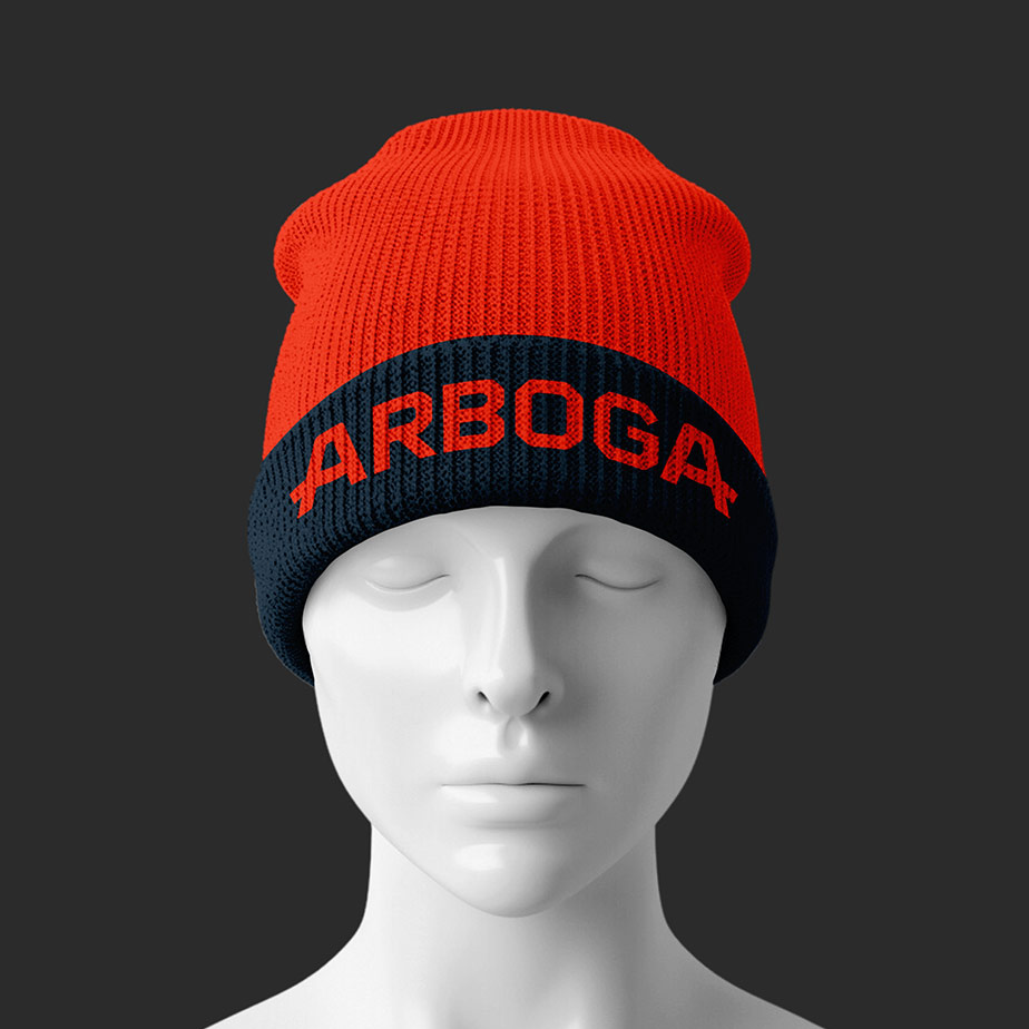
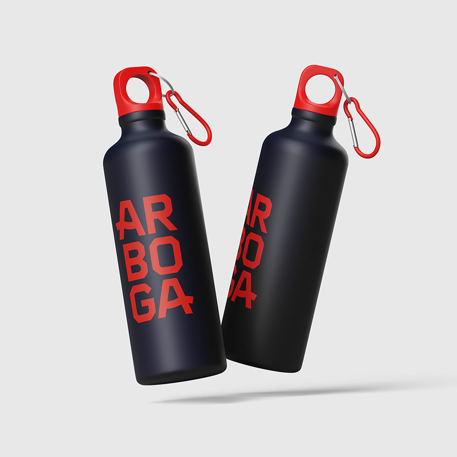
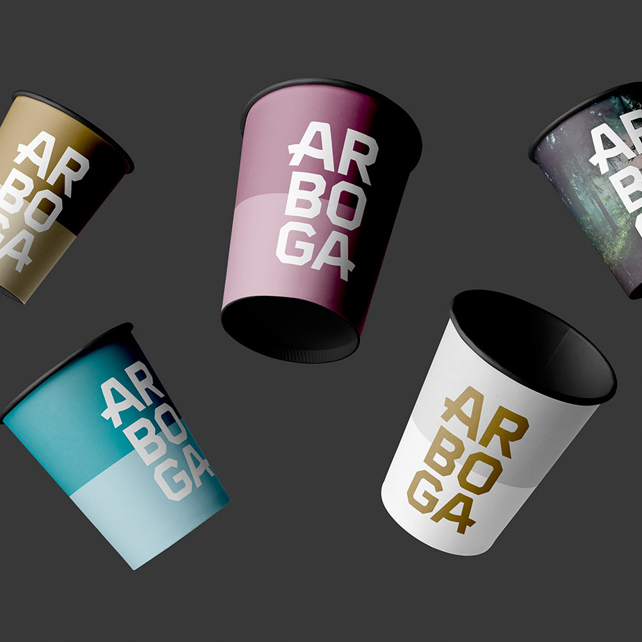
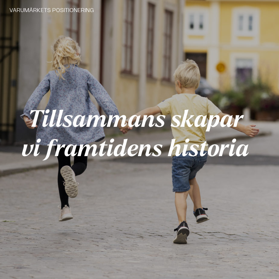
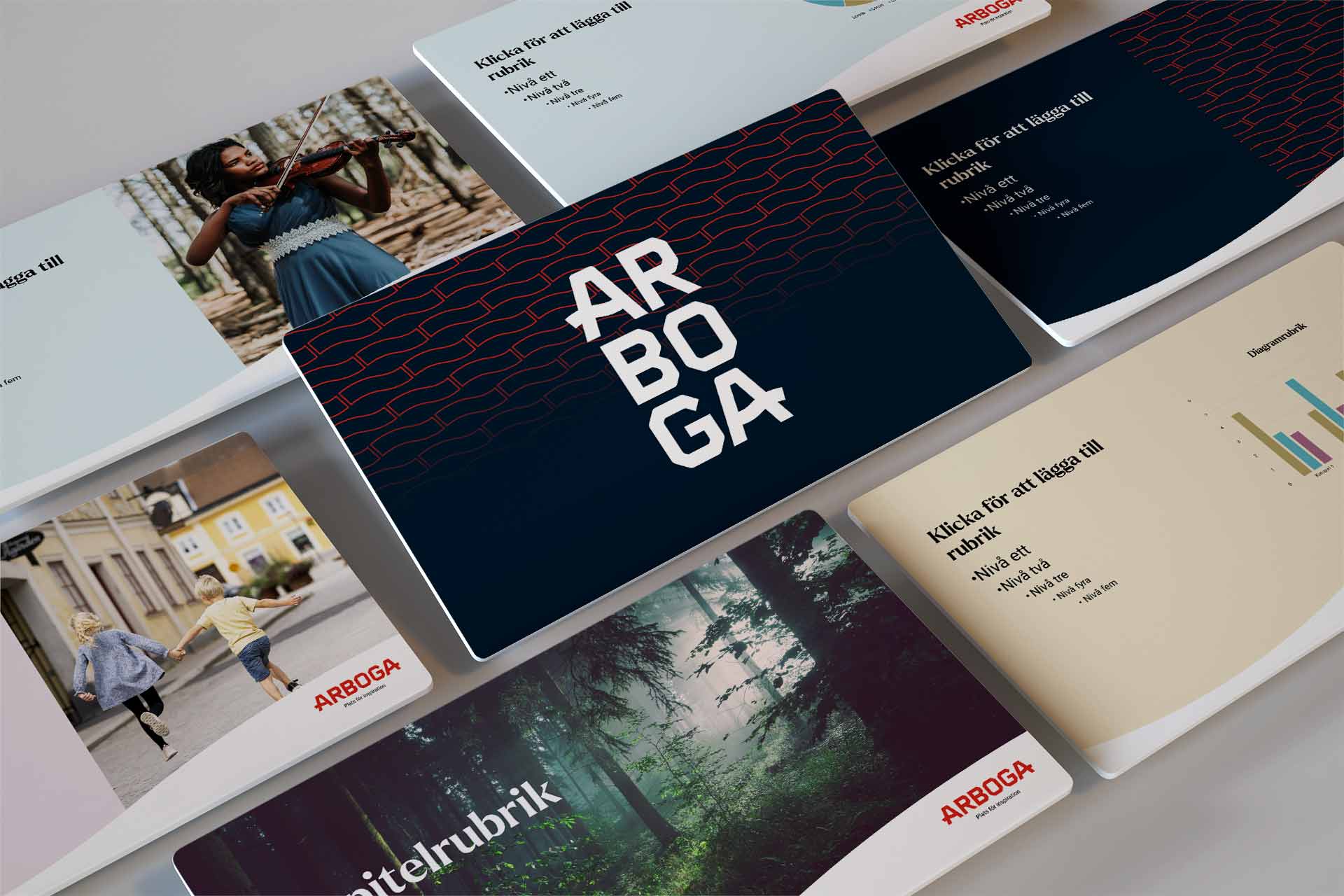
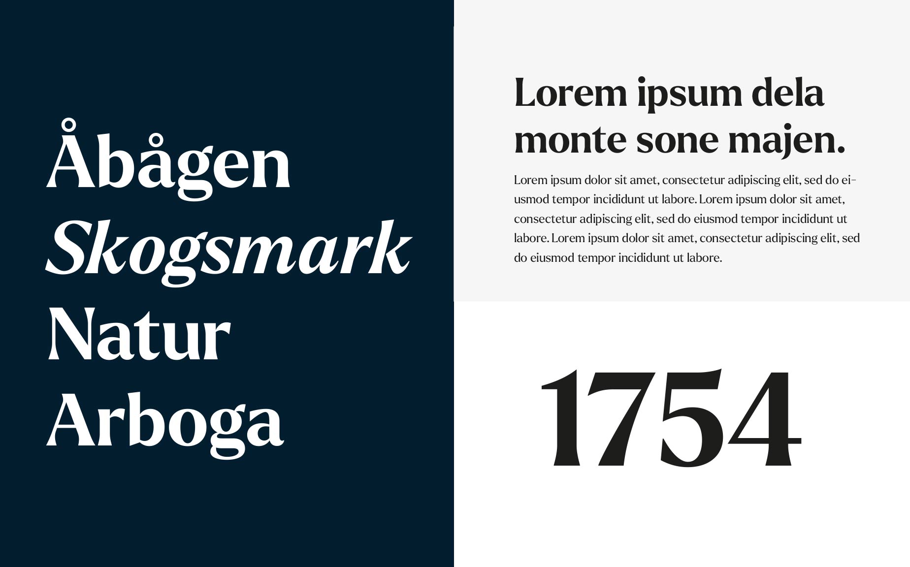
The previous identity strongly emphasised Arboga’s medieval associations. In the new expression, we chose to retain the municipality’s established red as a link to recognition and heritage, while introducing a broader palette, including a deep French navy blue, to better reflect the town’s range and contemporary character. The wordmark itself was redesigned to express the new positioning: “Together, we create the future’s history.” It moves away from a purely historical tone and instead balances industrial precision with human warmth – built on a strict grid system, yet softened by rounded, responsive forms.
Result
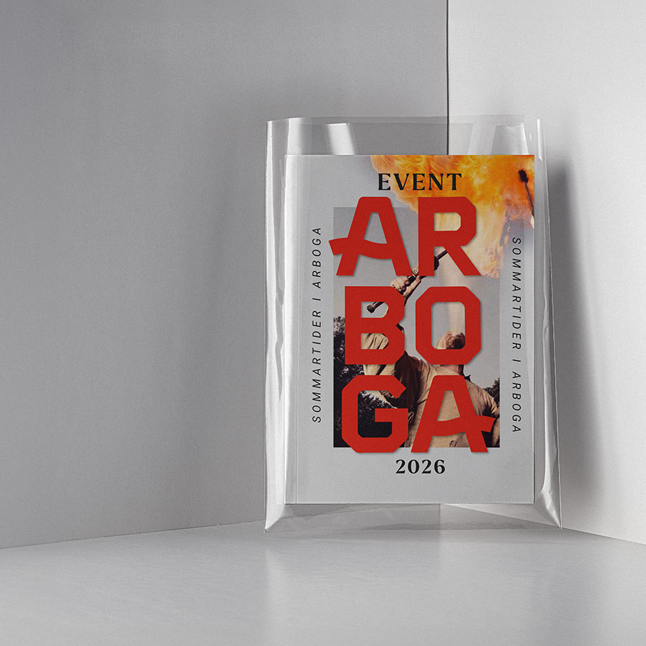
The result is a new visual identity designed to tell the whole story of Arboga. It gives the municipality a clearer and more flexible way to communicate both its historical depth and its modern strengths – from small-scale charm and a sense of safety to innovation, technology, and strategic importance in areas such as cyber defence.
By retaining recognisable elements while shifting the overall tone, the new identity helps reposition Arboga as a place where history and future development coexist. It creates better conditions for the municipality to present a more nuanced, confident, and contemporary image of itself over time. The work was also very well received when it was formally approved by the municipal council, confirming strong support for the new direction.
Arboga municipality’s new brand platform and visual identity were presented in March 2025 and will be implemented gradually in the years ahead.
Agency: Project created by Think Happy Thoughts


Arbogaån inspiration till logotypen
Namnet Arboga härstammar från en krök i ån som slingrar sig genom staden. Ursprungligen kommer det från den äldre stavningen "Arbughi" som betyder "åbåge". Stadens läge gjorde den till en viktig handelsplats, där varor från Bergslagen skeppades ut till omvärlden. Logotypen tar fasta på arvet som ån bär med sig, genom den subtila vågrörelse som återfinns i namnets första och sista bokstav. Precis som när ån kommer in i staden från sidan och stillsamt flyter genom den, för att sedan leta sig ut på andra sidan.


Selected Works
Flex branding & interfaceUX, branding

Marketing minds branding and conceptBranding, Concept


Arboga place brandingBranding, strategy
Boka branding & webUX, branding
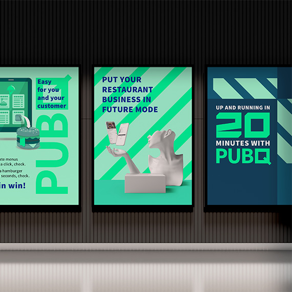
PubQ branding & webUX, branding
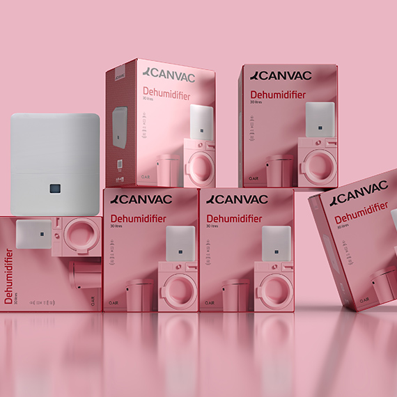
Canvac packagingPackaging, branding
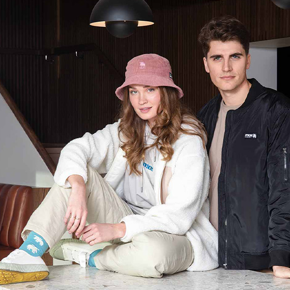
Moz conceptConcept