
In this case
Webdesign
UX
Wordpress
Branding
Visual identity
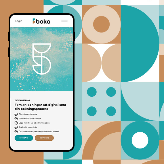
Boka – dressed for growth
Challenge
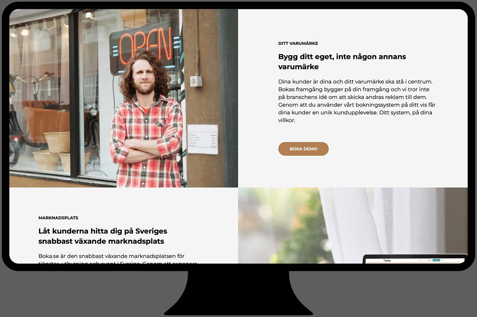
“Be bookable online in 5 minutes.” That is Boka’s powerful elevator pitch — a timely and compelling offer. But how do you make that offer land when the brand platform and visual identity do not reflect its strength, and when you are competing with a rival that has far greater financial resources?
Solution
In close collaboration with Boka, we developed a new brand platform and completely redesigned the visual identity. We structured the offer around two clear paths: Boka Ready to Go — up and running in 5 minutes — and Boka Enterprise — a more tailored solution. The design concept, inspired by geometric forms drawn from the analogue clock, became the guiding principle across the visual identity.
Result
We gave getboka.se, Boka’s site for business customers, a completely new expression. At the same time, Boka also updated its consumer-facing marketplace internally. Everything launched in early summer 2022, leaving Sweden’s best booking system well equipped for a highly competitive fight for customers.
Agency: Project created by Think Happy Thoughts


Design concept
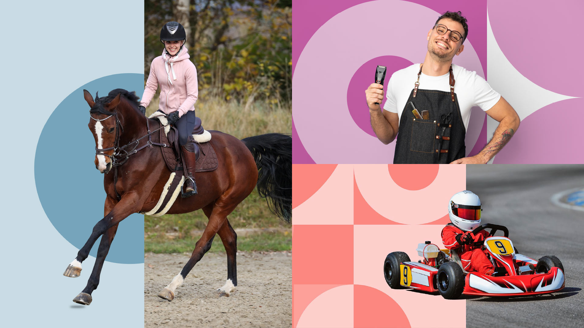
Boka’s customers are constantly looking to fill hours, half hours, and quarter hours with new bookings. With Boka’s tool, they can put their busy minds at ease — the booking takes care of itself.
We broke down the classic circular shape of the clock into its core elements. From these soft, rounded forms, we built the design.


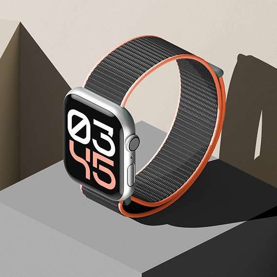
Custom-drawn numerals
The geometric forms from the design concept are also reflected in a set of numerals created specifically for Boka. They serve a decorative purpose and are used, among other things, to highlight statistics.
Selected Works
Flex branding & interfaceUX, branding

Marketing minds branding and conceptBranding, Concept


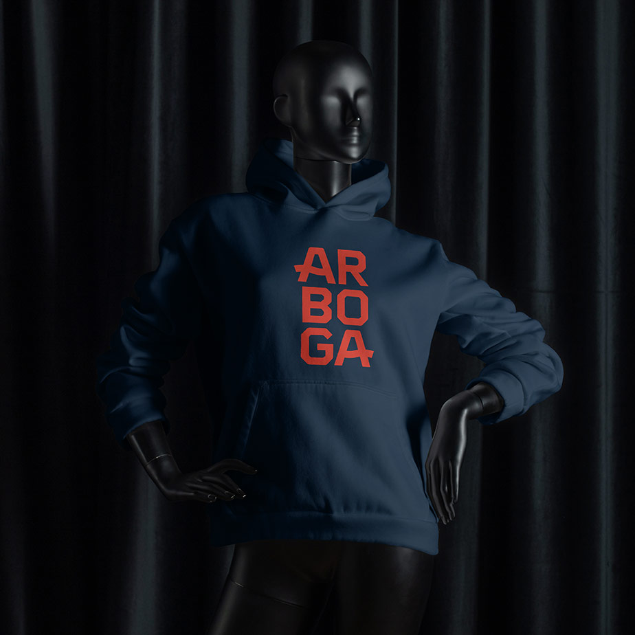
Arboga place brandingBranding, strategy
Boka branding & webUX, branding
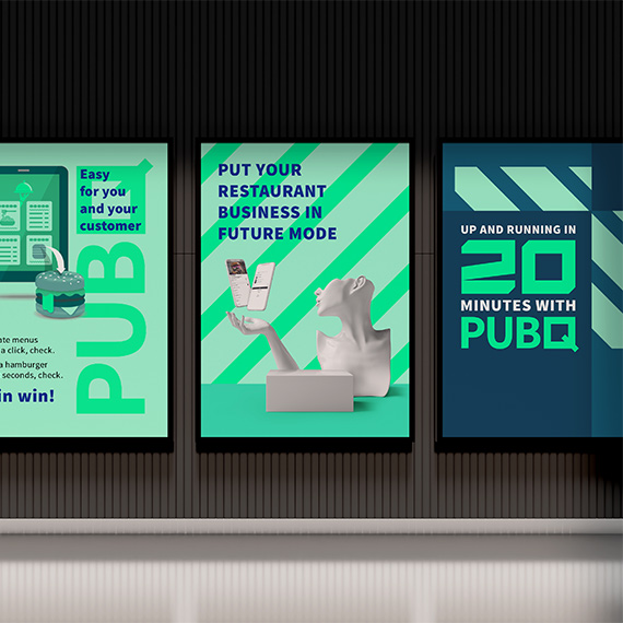
PubQ branding & webUX, branding
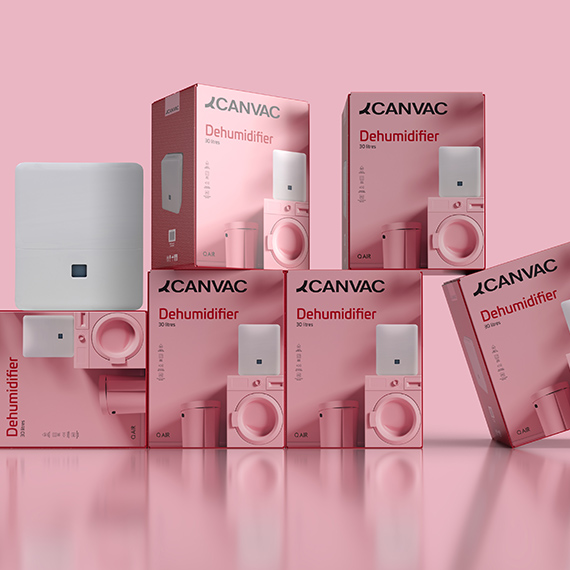
Canvac packagingPackaging, branding
Moz conceptConcept